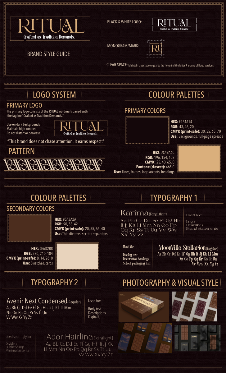
Category
Brand Identity
Industry
Premium Chocolate
Deliverables
Logo · Palette · Typography · System
Year
2024
The Brief

"A chocolate brand built for people who believe pleasure should be earned — slowly."

RITUAL is a premium single-origin chocolate brand rooted in the philosophy that the best things in life are never rushed. Every bar, every truffle, every square of RITUAL chocolate is the result of a deliberate process — from bean selection to the final temper — and the brand identity had to reflect exactly that.

The challenge was to create a visual identity that felt unmistakably luxurious without leaning on the tired tropes of gold foil and velvet. Instead, the brand draws its palette from the chocolate itself — the deep browns of cacao husks, the warm cognac of aged ganache, the burgundy of a slow-cooked reduction — and its typography from the Old-Style tradition of European confectionery.

BrandRITUAL Chocolate
PositioningPremium Single-Origin
ScopeFull Brand System
DeliverablesLogo Suite, Colour System, Typography, Packaging Direction
ToneSlow · Deliberate · Earned
ToolsIllustrator · Photoshop · InDesign
The Logo System 01
Primary Wordmark

Where the mark earns its place.

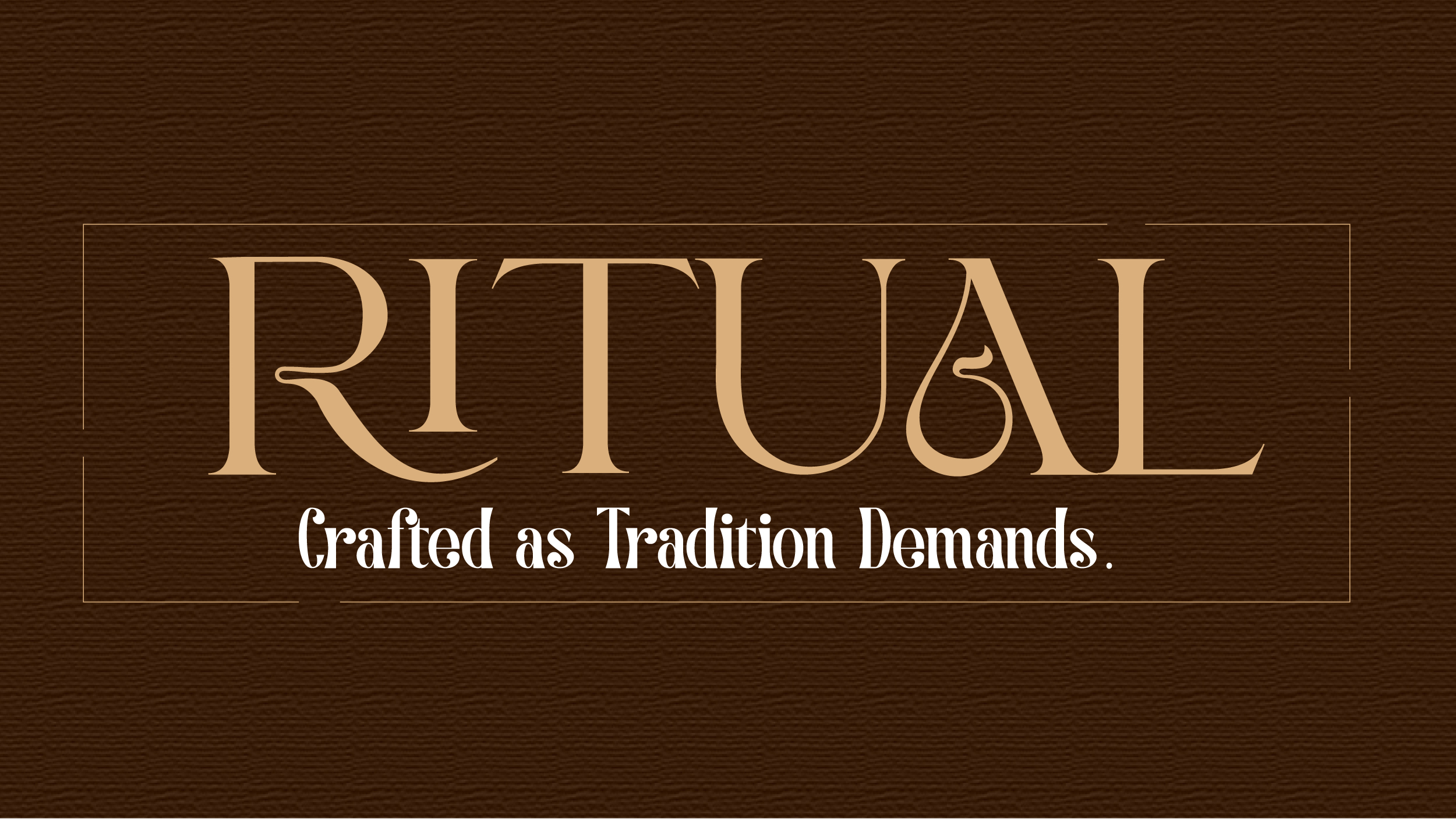
The RITUAL wordmark is set in Karma — an Old-Style serif with roots in classical European typography. Its generous contrast between thick and thin strokes mirrors the ritual of tempering: precision meeting patience. The rectangular containment frame references both chocolate bar packaging and the deliberate borders of heritage confectionery. The tagline, "Crafted as Tradition Demands," is set in MoonVilla Stallion — a hand-lettered script that introduces warmth and human touch.

The logo works in two colorways: Cognac-on-Brown for primary packaging and marketing, Black-on-Cream for secondary print applications and editorial contexts.

RITUAL Primary Logo — Cognac on leather brown
Brand Style Guide 02
RITUAL Brand Style Guide — Full System
The Colour System

The palette
of cacao.

Dark Cacao
Primary — Backgrounds
#2B1A14
Cognac
Primary — Accents & Logo
#C4916C
Raw Sienna
Secondary — Sections
#563B2A
Burgundy
Secondary — Accents
#660200
Typography System

Type that tastes like something.

Karma — Wordmark & Display
RITUAL
Logo · Headlines · Brand Statements
Avenir Next Condensed — Body & UI
Aa Bb Cc Dd Ee Ff Gg Hh Ii Jj Kk Ll Mm
Nn Oo Pp Qq Rr Ss Tt Uu Vv Ww Xx Yy Zz
Body Copy · Ingredients Lists · Digital UI
Ador Hairline — Supporting Text
Single Origin · 72% Cacao
Labels · Percentage Marks · Secondary Details
"This brand does not chase attention.
It earns respect."

Brand Direction — RITUAL, 2024

Typography Principle

Every typographic decision in the RITUAL system is driven by restraint. No decorative flourishes beyond what is necessary, no weight heavier than what the context demands. The hierarchy is clear: Karma commands the space at the top, Avenir Next Condensed organises information cleanly below it, and Ador Hairline whispers the finest details.

Packaging Direction 04
How the Brand Lives on Product

A bar worth holding.

The packaging direction for RITUAL is built on restraint and material honesty. Dark kraft paper stocks, textured like the cacao husk itself, provide the base. The wordmark is embossed or foil-blocked in cognac — never printed flat, always three-dimensional, always tactile. The brand's luxury is communicated through touch before it's seen.

RITUAL
Single Origin · 72% Dark Cacao
Crafted as Tradition Demands
RI